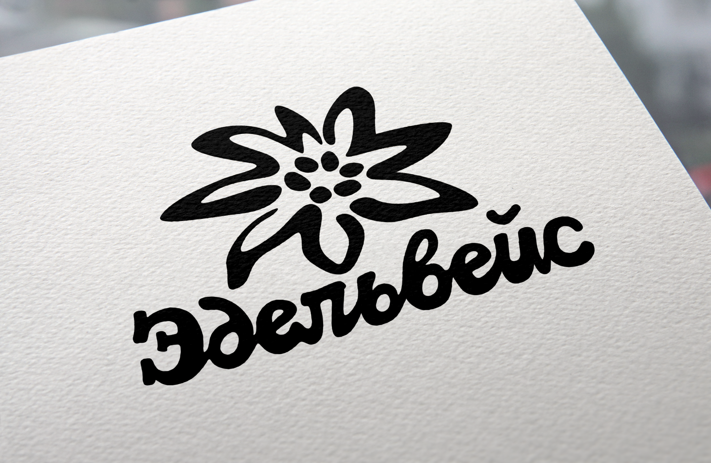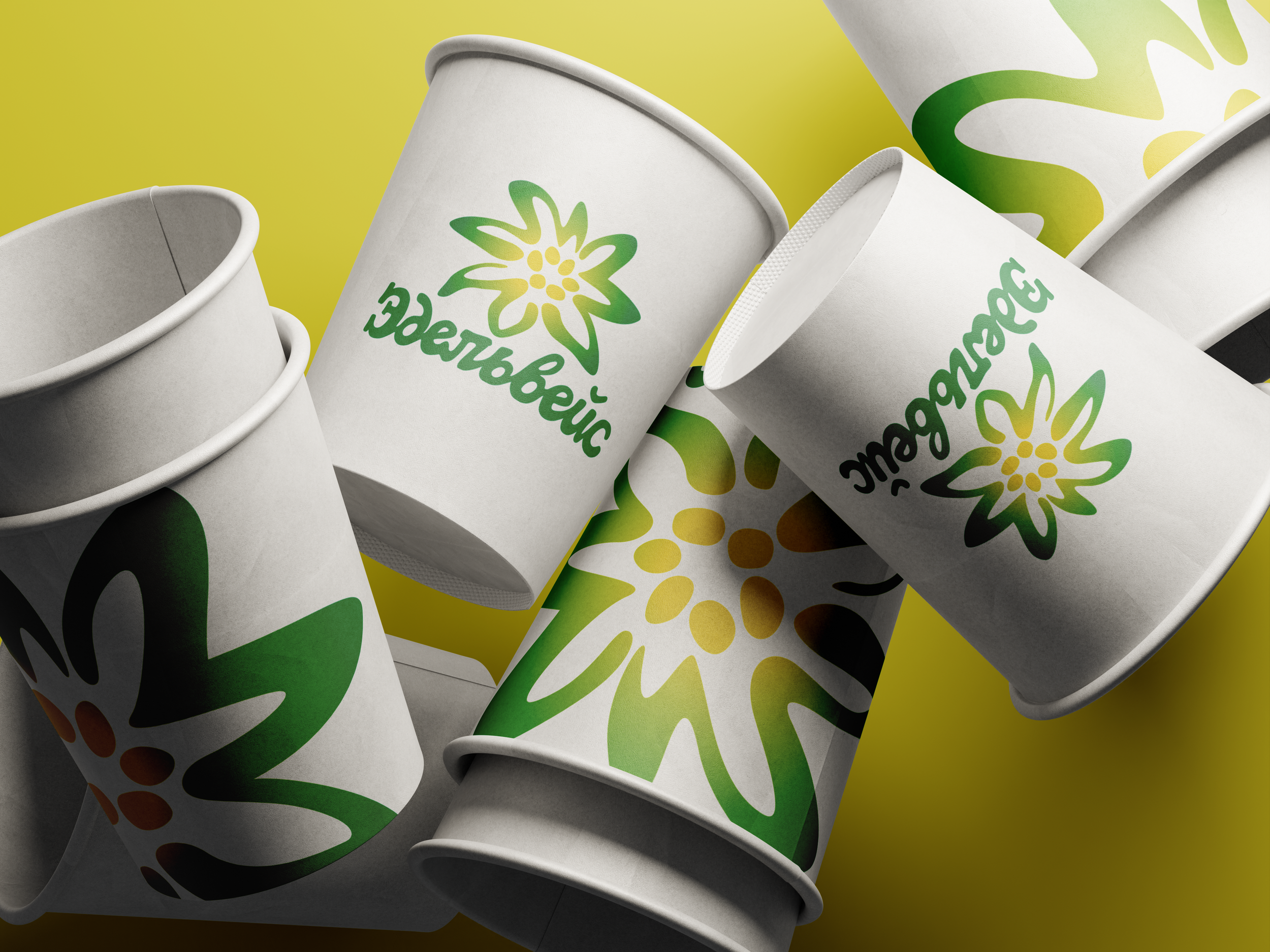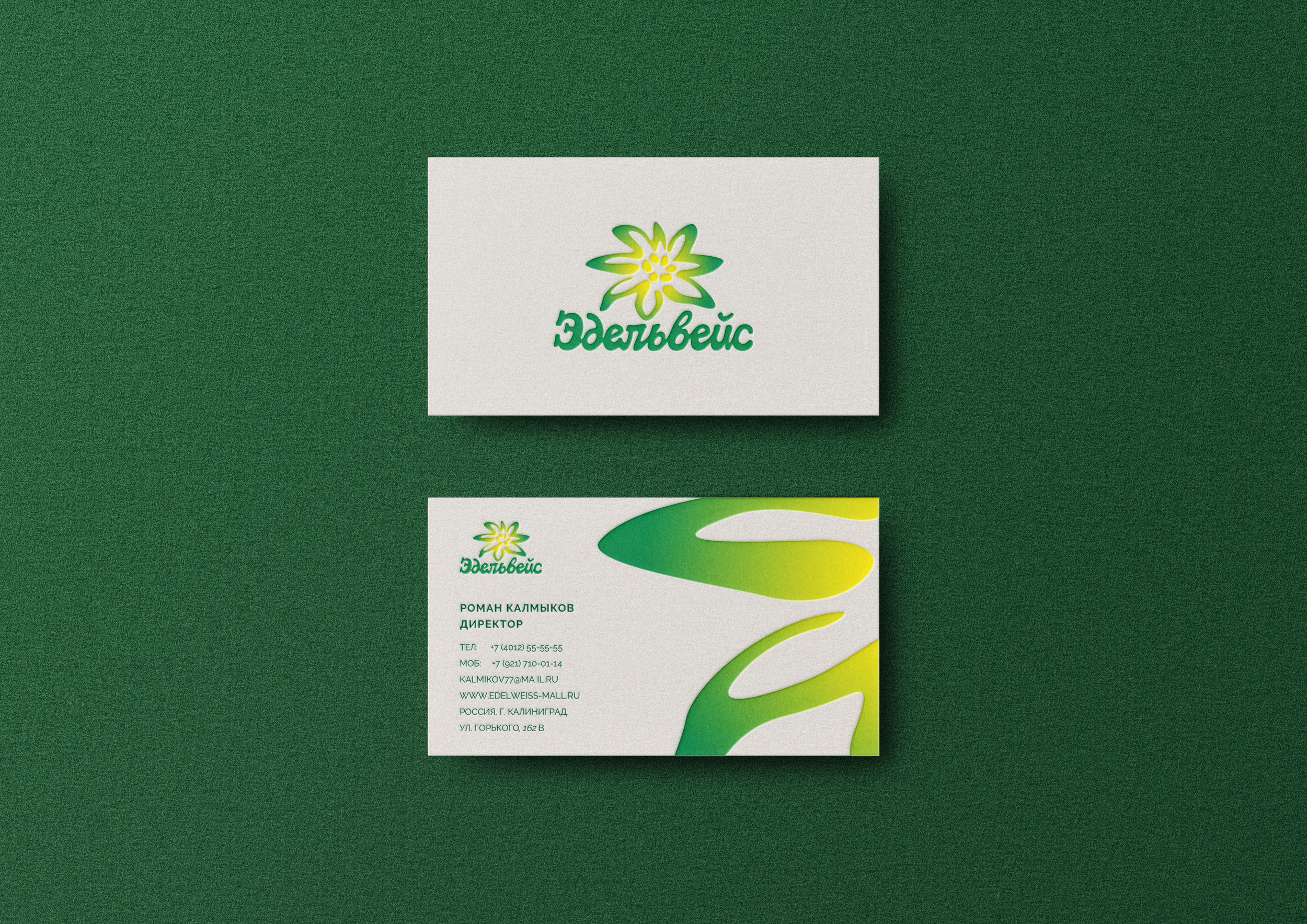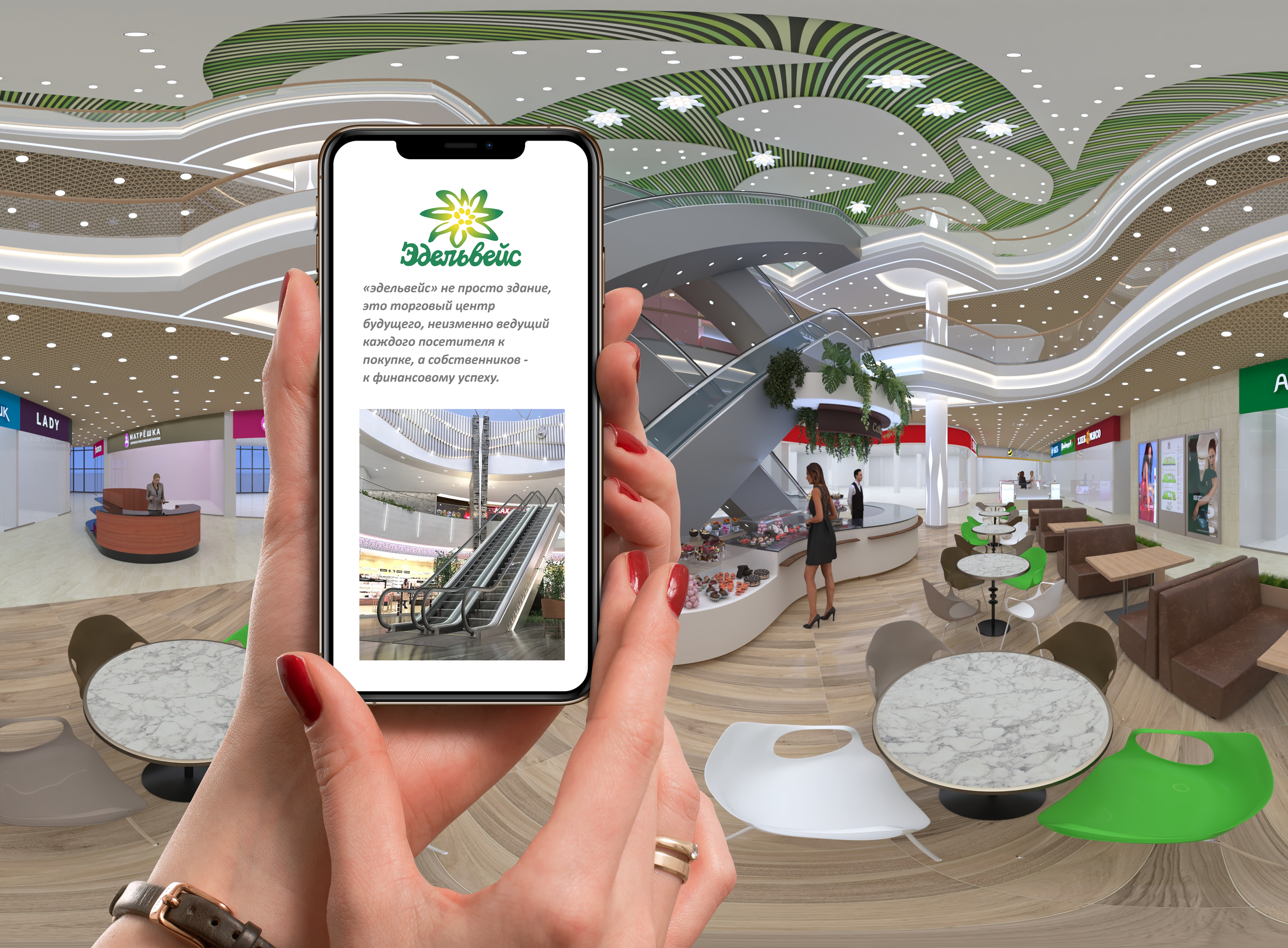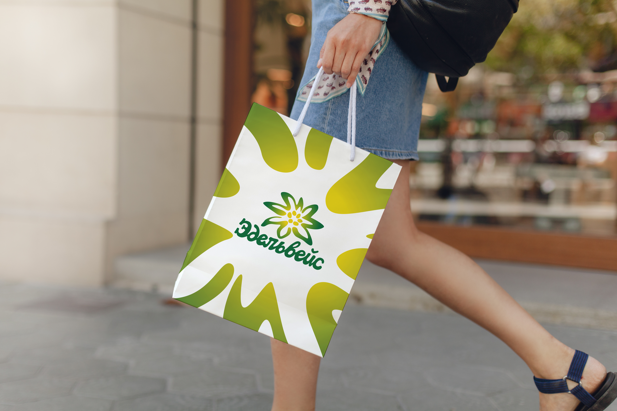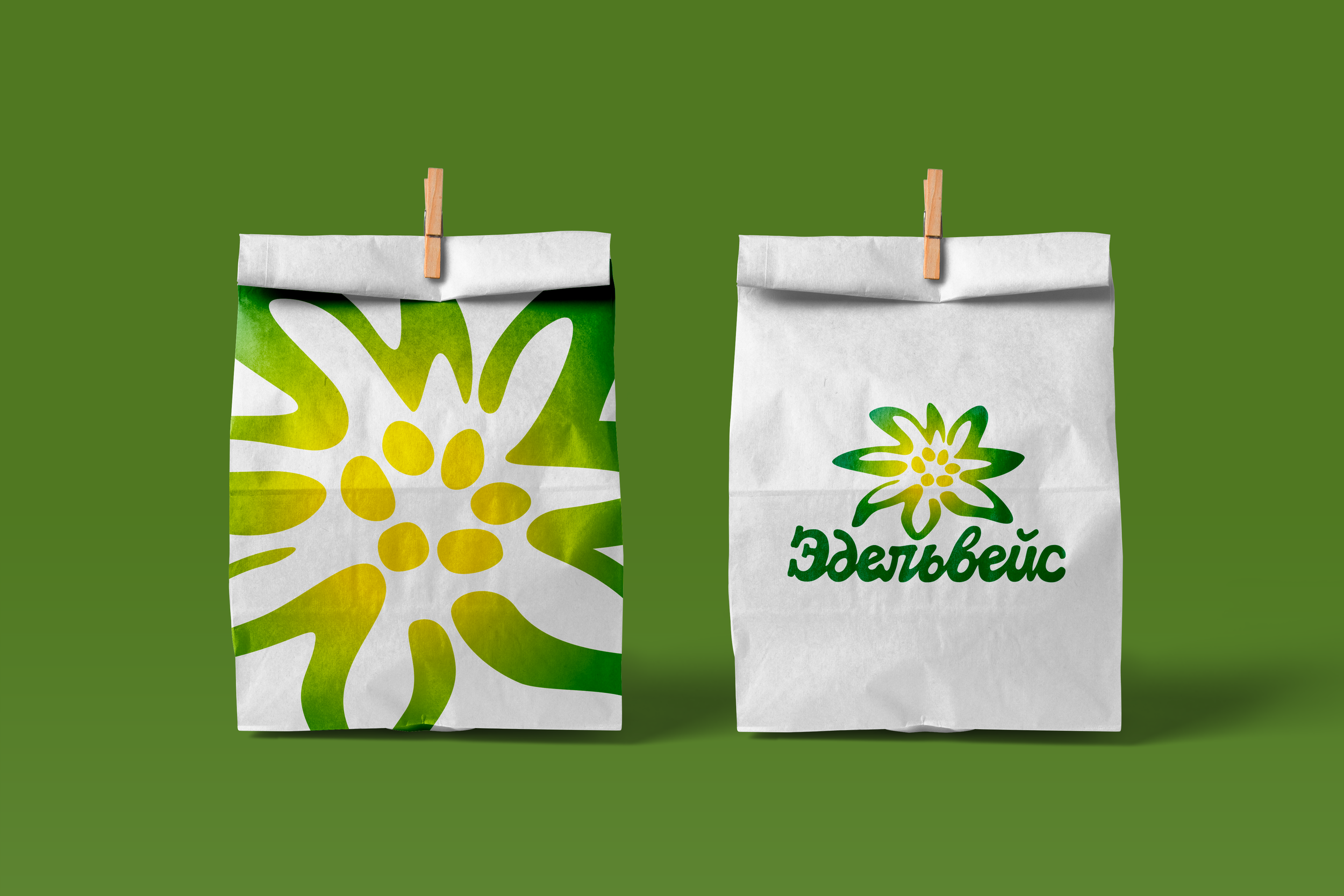
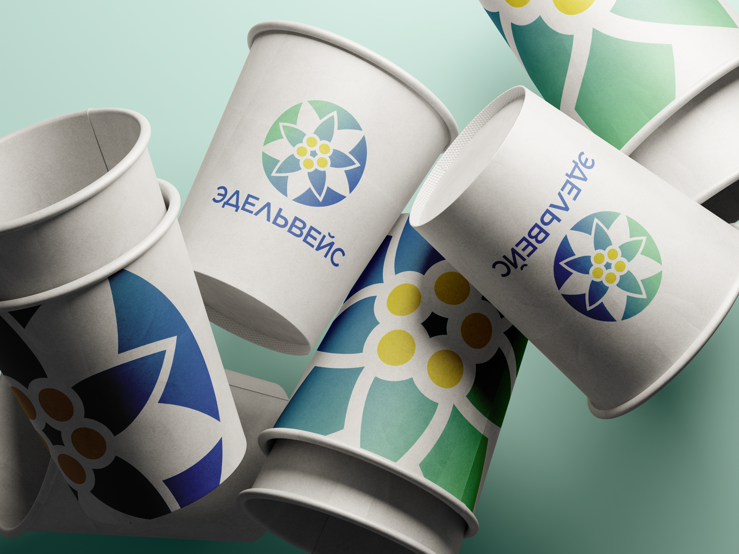
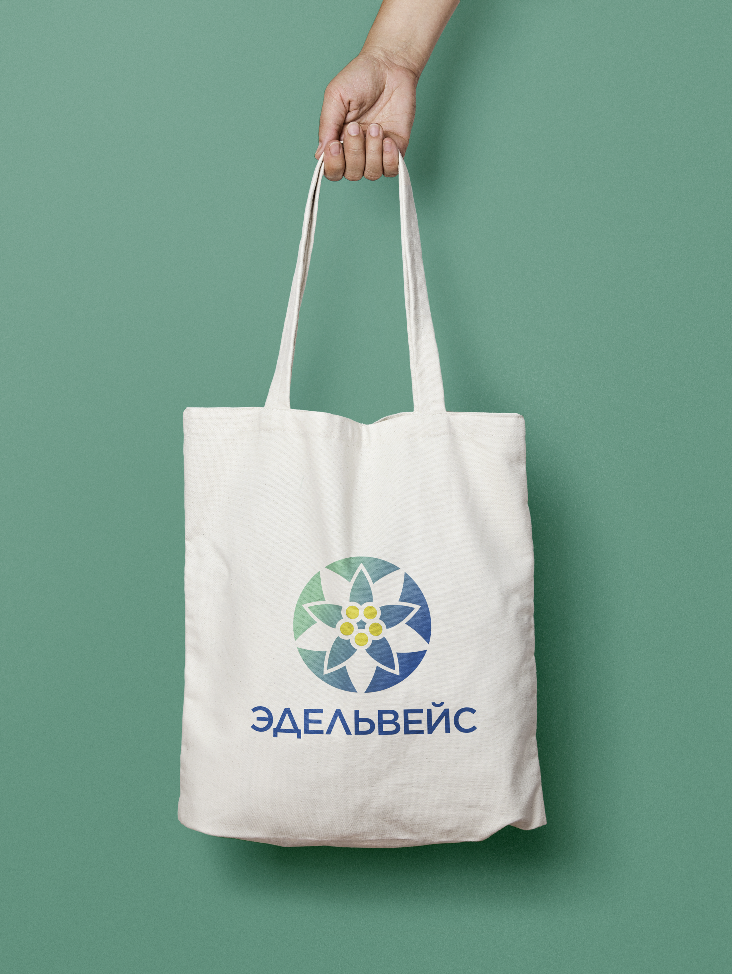
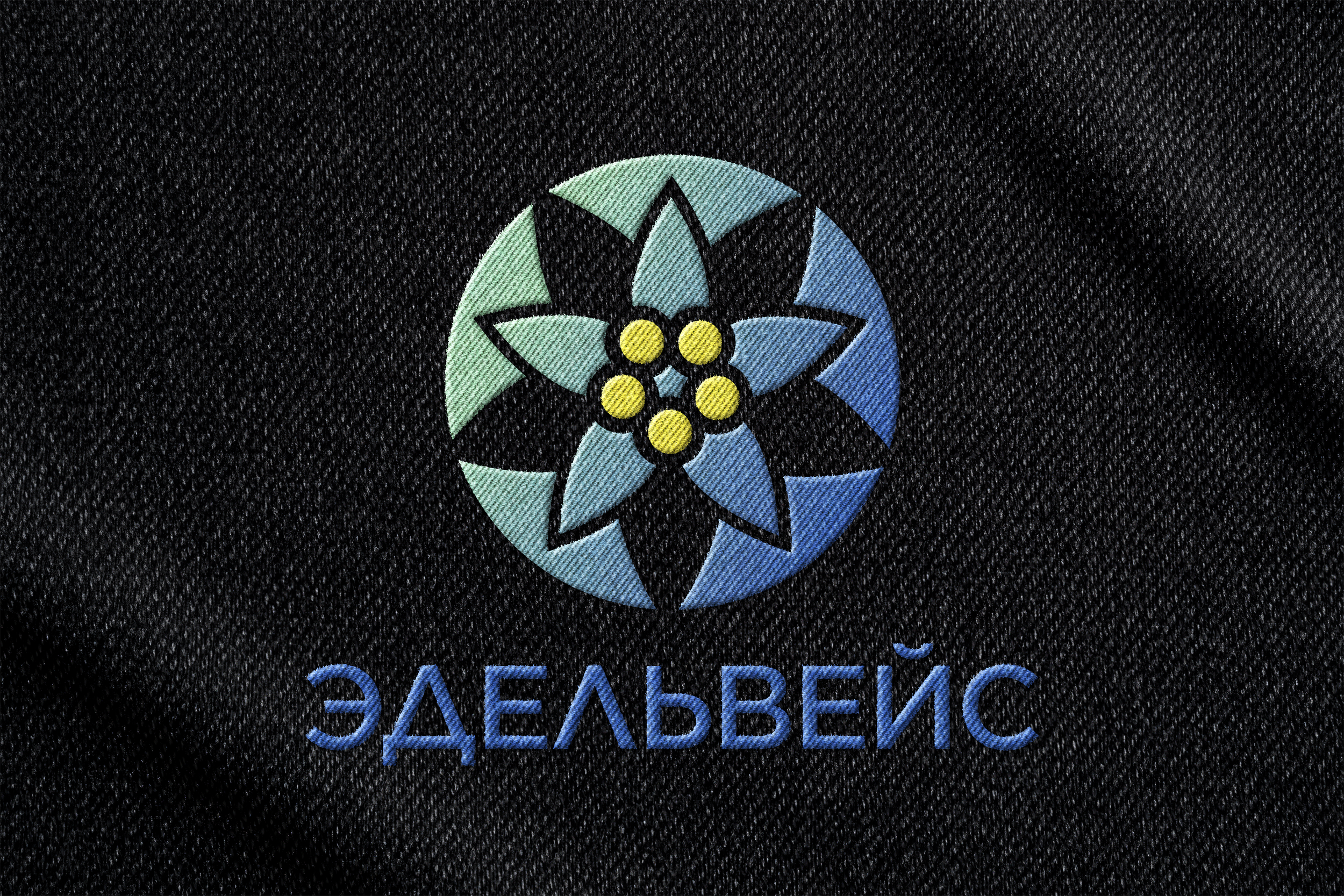
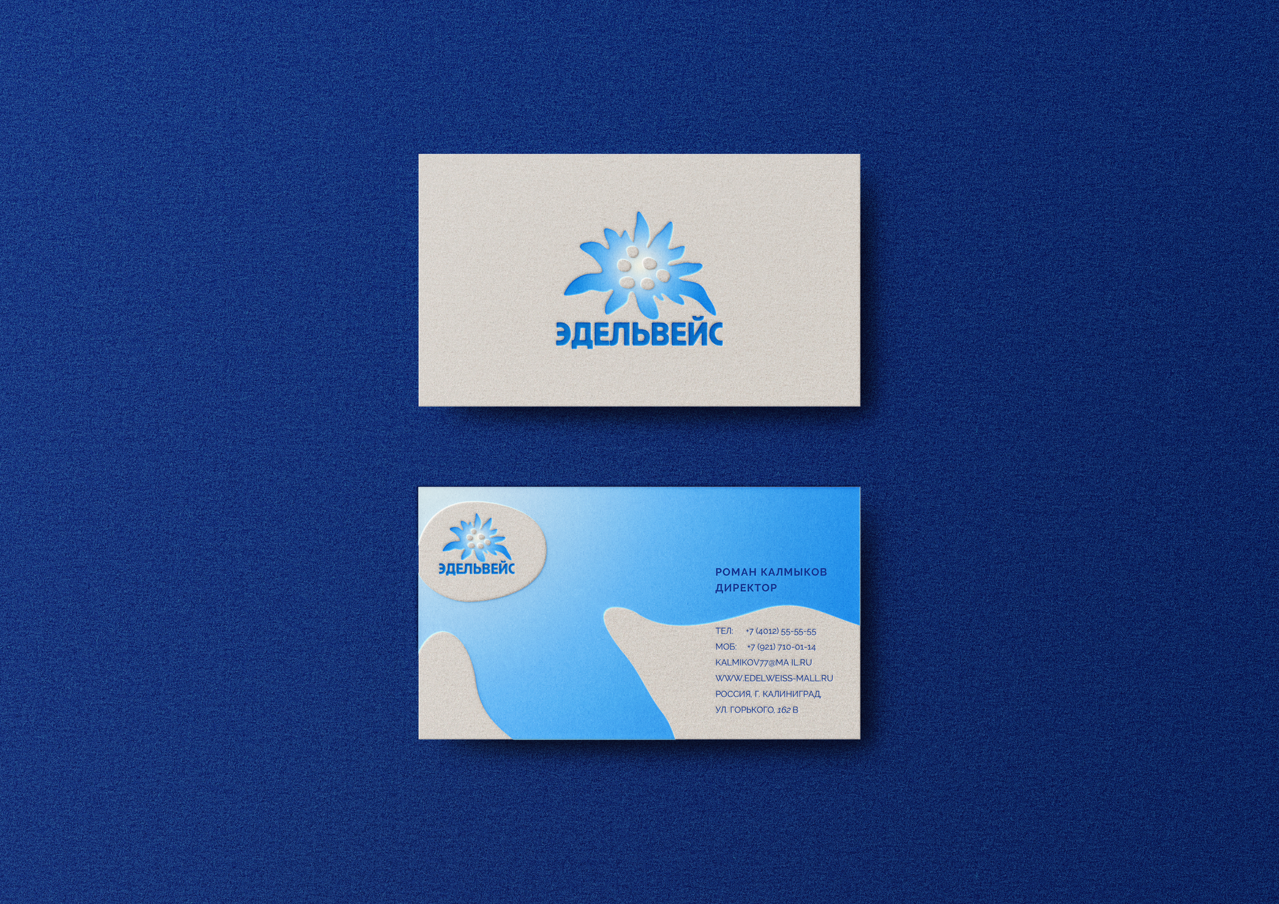
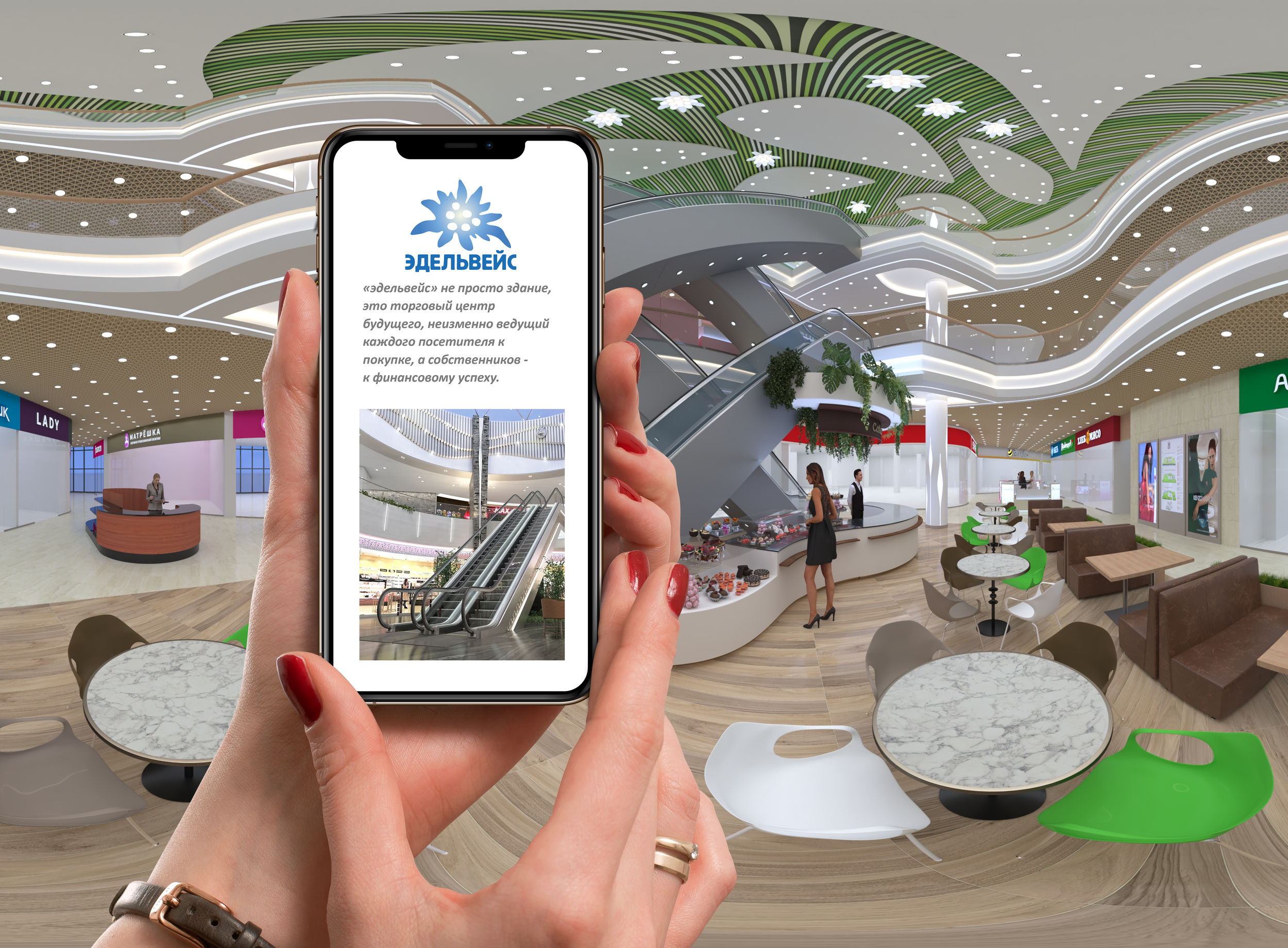
Edelweiss Logo Design
I designed the logo for the shopping center Edelweiss, drawing inspiration from the local edelweiss flower to reflect the area’s natural identity. The mark blends organic forms with a modern feel to create a recognizable, place-based brand.
Logo Option 01
A distilled, geometric interpretation of the edelweiss flower, reduced to its most essential forms. The minimal structure creates a bold, contemporary mark that feels timeless and highly adaptable across print and digital applications.

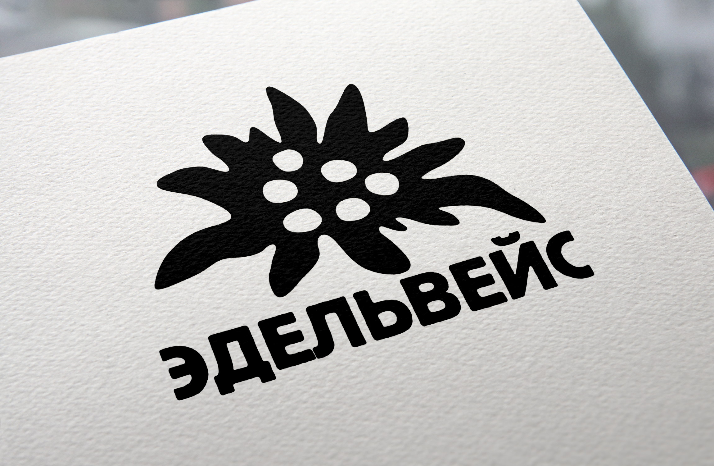
Logo Option 02
A simplified, organic edelweiss silhouette that leans into soft curves and negative space for an approachable, human feel. The bold shape ensures strong legibility at small sizes while maintaining a distinctive, place-based identity.


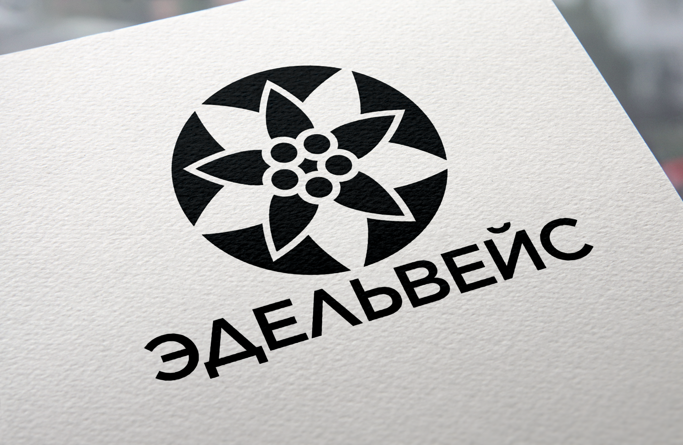
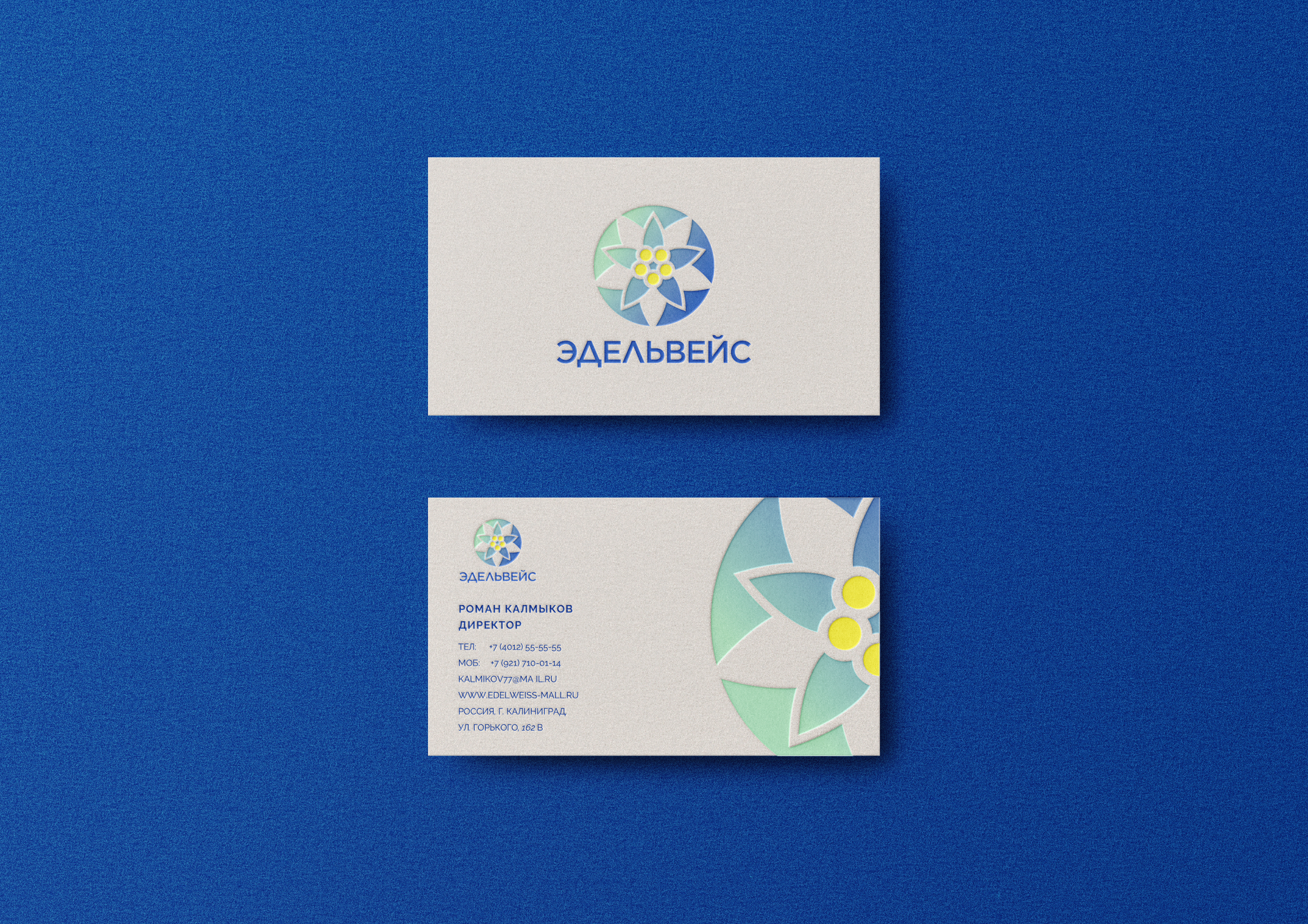
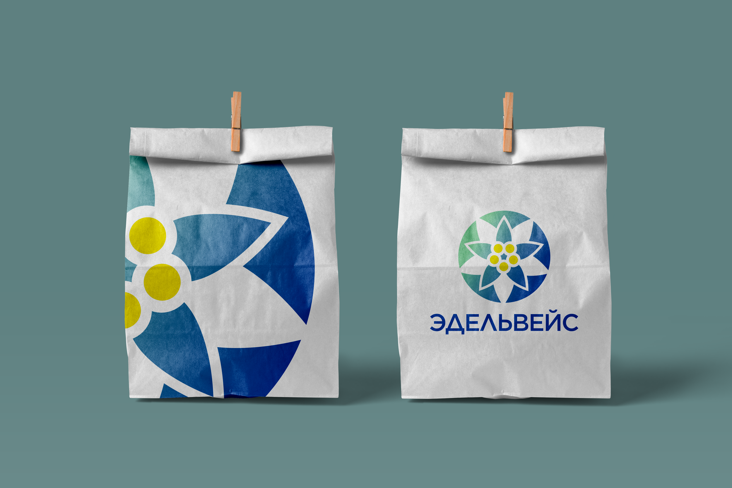
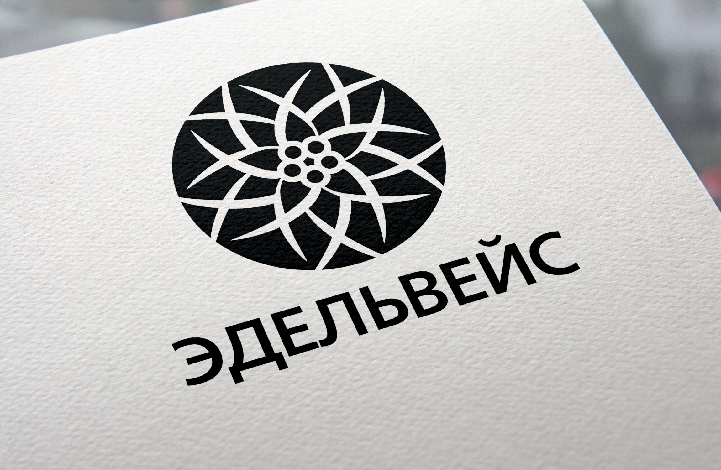
Logo Option 03
A circular, geometric interpretation of the edelweiss, built from intersecting forms to create a structured, modern symbol. The mark emphasizes balance, symmetry, and scalability, making it well-suited for signage and branding across the shopping center.


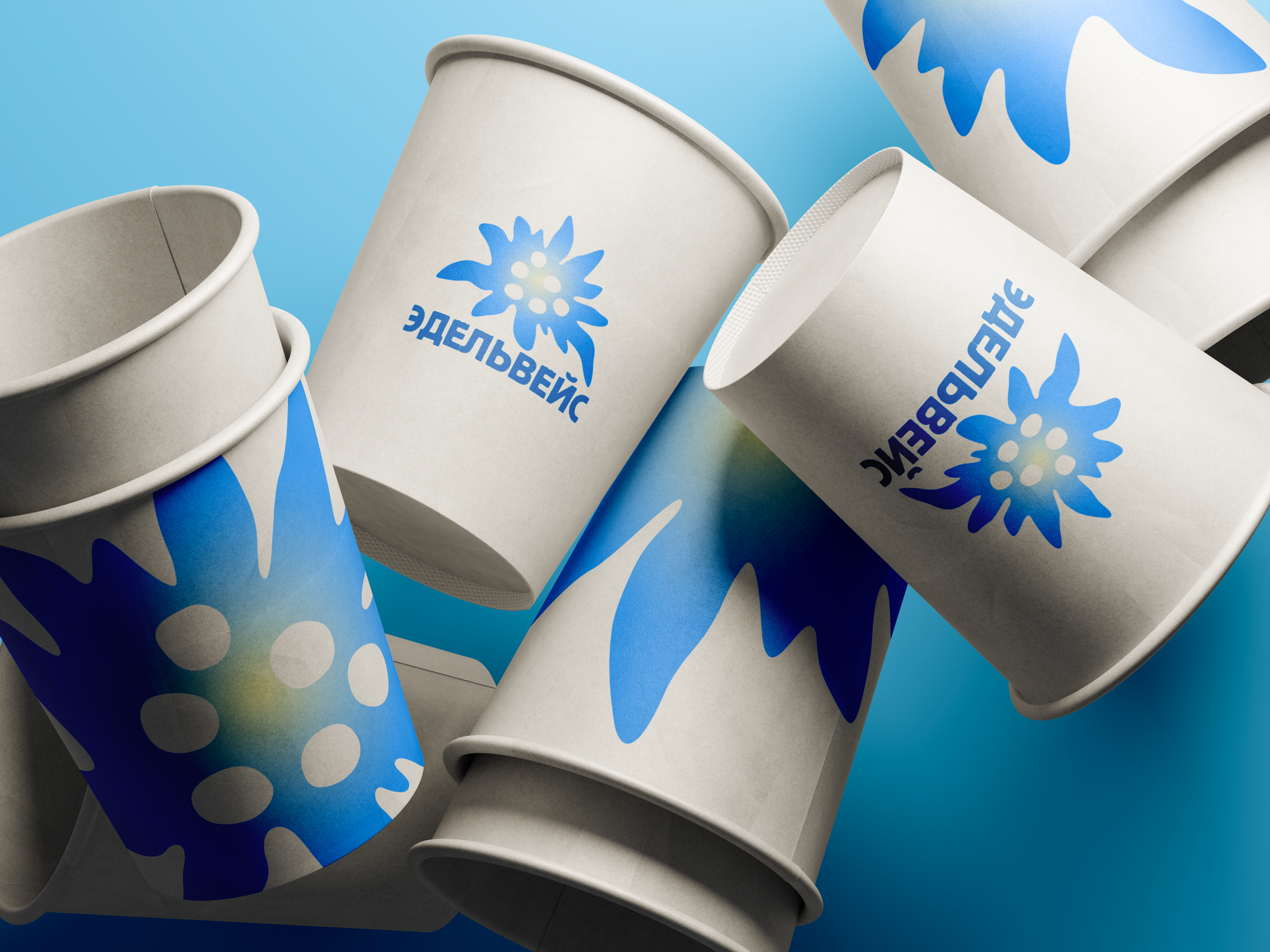
Logo Option 04
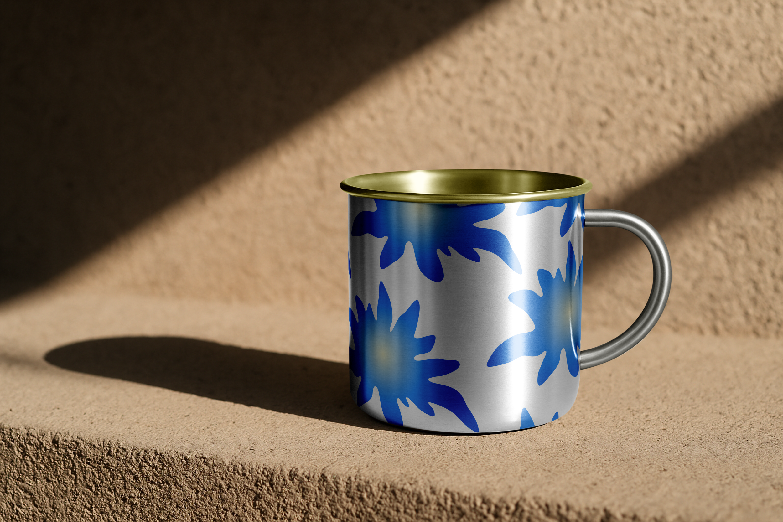
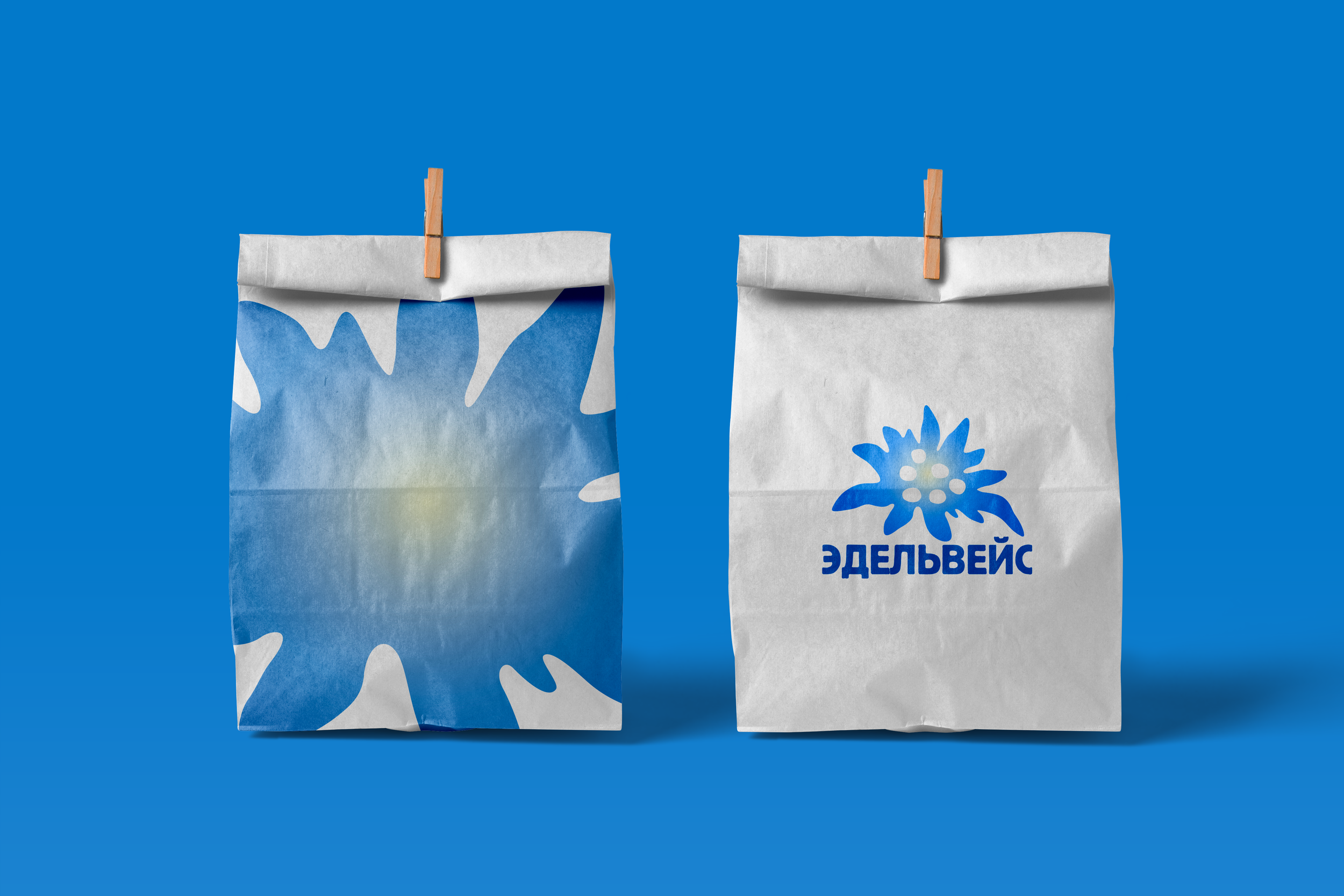
An expressive, painterly interpretation of the edelweiss with loose, organic forms and soft edges. The hand-drawn quality brings warmth and character to the identity, adding an artisanal feel to the brand system.